JSS 사용 방법
김영수 주임
이번 포스팅은 JSS(Javascript Style Sheet)에 대해서 알아보겠습니다.
HOC 방식은 v10부터 더 이상 사용되지 않으며 v11에서 제거되므로 Hook 방식의 사용 방법을 알아보겠습니다.
JSS v10.0.0-alpha.24 버전을 기반으로 작성하였습니다.
설치
$ yarn add react-jss@10.0.0-alpha.24
기본 사용
import * as React from "react";
import { createUseStyles } from "react-jss";
export const App = () => {
const styles = useStyles();
return (
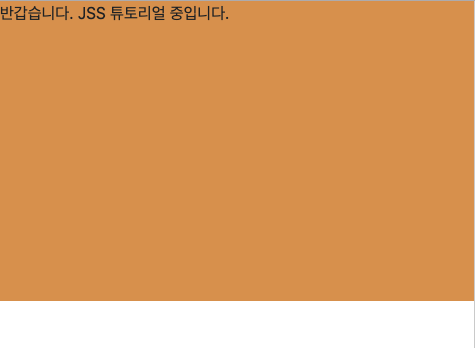
<div className={styles.customContainer}>
반갑습니다. JSS 튜토리얼 중입니다.
</div>
);
};
// createUseStyles 안에 스타일을 작성하시면 됩니다.
// CSS 속성 중 '-'가 들어가는 요소 예)text-align, background-color 등은
// textAlign, backgroundColor 처럼 카멜케이스 형식으로 사용하거나,
// 'text-align', 'background-color' 처럼 작은 따옴표를 씌워서 사용할 수 있습니다.
// 값의 경우, 뒤에 px, % 등을 명시하지 않으면 기본 설정(px)으로 인식됩니다.
const useStyles = createUseStyles({
customContainer: {
width : '100%',
height: '500px',
backgroundColor : '#dd9c4f',
}
});
결과화면
전역 스타일
App.tsx
import * as React from "react";
import { createUseStyles } from "react-jss";
import { ChildTest } from "./ChildTest";
export const App = () => {
const styles = useStyles();
return (
<React.Fragment>
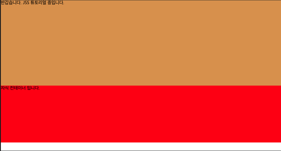
<div className={styles.customContainer}>
반갑습니다. JSS 튜토리얼 중입니다.
</div>
{/* // 자식 컴포넌트 */}
<ChildTest />
</React.Fragment>
);
};
const useStyles = createUseStyles({
// 전역적으로 사용할 CSS는 "@global"안에 정의하면 됩니다..
// 전역 클래스의 경우 앞에 '.' 점을 붙여야 됩니다!!
"@global": {
body: {
margin: 0,
padding: 0
},
".container": {
backgroundColor: "red",
height: "200px"
}
},
customContainer: {
width: "100%",
height: "300px",
backgroundColor: "#dd9c4f"
}
});
자식 컴포넌트(ChildTest.tsx)
import * as React from "react";

export const ChildTest = () => {
  return <div className="container">자식 컨테이너 입니다.</div>;
};
결과화면
미디어 쿼리
import * as React from "react";
import { createUseStyles } from "react-jss";
export const App = () => {
React.useEffect(() => {
// 기존 class 컴포넌트의 componentDidMount
window.addEventListener("resize", resizeHandle);
return () => {
// 기존 class 컴포넌트의 componentWillUnmount
window.removeEventListener("resize", resizeHandle);
};
}, []);
const [windowWidth, setWindowWidth] = React.useState(window.outerWidth);
const styles = useStyles();
const resizeHandle = React.useCallback(() => {
setWindowWidth(window.innerWidth);
}, []);
return (
<React.Fragment>
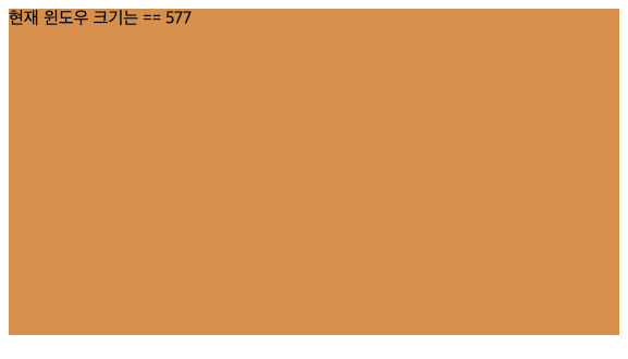
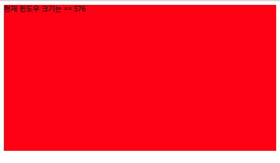
<div className={styles.customContainer}>
현재 윈도우 크기는 == {windowWidth}
</div>
</React.Fragment>
);
};
const useStyles = createUseStyles({
// 일반 CSS와 사용법이 많이 다르지 않습니다.
customContainer: {
width: "100%",
height: "300px",
backgroundColor: "#dd9c4f"
},
// 윈도우 가로 크기가 576px 이하일 경우
"@media (max-width: 576px)": {
customContainer: {
backgroundColor: "red"
}
},
});
결과화면
composes
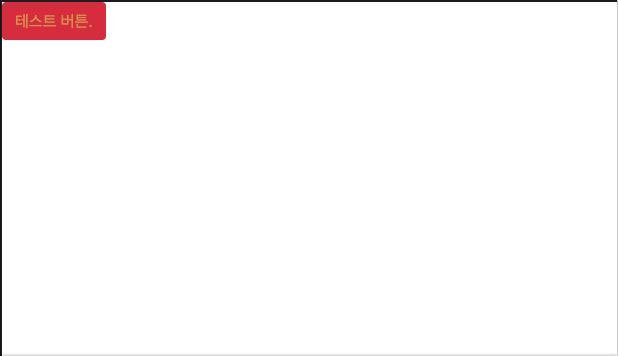
JSS는 Material UI나 Bootstrap와 함께 결합하여 사용할 수 있습니다. Bootstrap을 예로 사용해보겠습니다.
import * as React from "react";
import { createUseStyles } from "react-jss";

export const App = () => {
  const styles = useStyles();
  return (
    <React.Fragment>
      <button className={styles.customButton}>테스트 버튼.</button>
    </React.Fragment>
  );
};
const useStyles = createUseStyles({
  customButton: {
    color: "#dd9c4f",
    // composes : [] 안에 Bootstrap css를 넣어주시면 됩니다. material도 마찬가지입니다.
    composes: ["btn", "btn-danger"]
  }
});

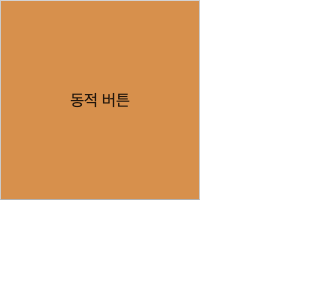
데이터 변화에 의한 동적 스타일링
import * as React from "react";
import { createUseStyles } from "react-jss";

export const ChildComponent = () => {
  const [backColor, setBackColor] = React.useState(true);

  const buttonClick = React.useCallback(() => {
    setBackColor(!backColor);
  }, [backColor]);

  const styles = useStyles(backColor);

  return (
    <React.Fragment>
      <button className={styles.customButton} onClick={buttonClick}>
        동적 버튼
      </button>
    </React.Fragment>
  );
};

const useStyles = createUseStyles({
  customButton: {
    // backColor 값이 true면 빨간색, false면 주황색을 칠한다.
    backgroundColor: (backColor: boolean) => (backColor ? "red" : "#dd9c4f"),
    width: "200px",
    height: "200px"
  }
});
결과화면
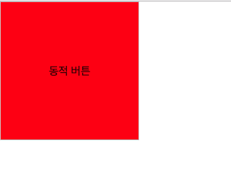
클릭 후 ↓↓↓↓↓↓↓↓↓↓↓↓↓↓↓↓↓↓↓↓↓↓↓↓↓↓↓↓↓↓↓
마치며
더 다양하고 많은 기능이 있지만 개발할 때 써먹을만 한 것들만 예제를 통하여 설명을 드렸는데 도움이 되셨길 바랍니다. 읽어주셔서 감사합니다.